


How to Set and Compare Date Ranges in Social Planner Statistics

Social Planner Statistics used to be locked to a fixed 7-day view. That made quick checks possible, but it also made deeper analysis harder than it needed to be.
If you wanted to review a campaign window, compare a launch period, or build a cleaner performance report, you often had to work around that limit. Now that fixed view has been replaced with a custom date range and comparative view selector, so you can analyze the exact period that matters.
This update gives teams a more flexible way to review social media performance, track trends, and explain results clearly without relying on external tools.
Why the new date range selector matters
A fixed 7-day view can be useful for a quick snapshot, but it is not ideal for real campaign analysis.
Most social media work does not happen in neat 7-day blocks. Promotions, launches, reporting periods, and trend reviews often follow custom schedules. When analytics are limited to one preset range, it becomes harder to answer simple questions like:
How did this launch perform from start to finish?
Did this promo beat the previous period?
Are current growth trends actually improving?
Which reporting window should we use for a client or internal team update?
With the new selector, we can choose the exact time period we want and compare it against another one right inside Social Planner Statistics.
What changed in Social Planner Statistics
The old fixed statistics view has been replaced by a more flexible setup:
Custom date range selection for the period you want to analyze
Comparison date range selection for benchmarking performance
Instant KPI and chart refresh so the updated data is visible right away
Built-in reporting support for campaign windows, trends, and growth analysis
This means you can move from a generic weekly snapshot to a more useful, self-serve analytics workflow.

In Social Planner, open the Statistics tab—this is where the new custom date range and comparison selector live.
How to set a date range in Social Planner Statistics
Here’s how the process works.
1. Open the Statistics view inside Social Planner
Start by going to the Statistics area in Social Planner. This is where your social performance metrics, totals, and charts are displayed.
Once you are there, look for the date selector.
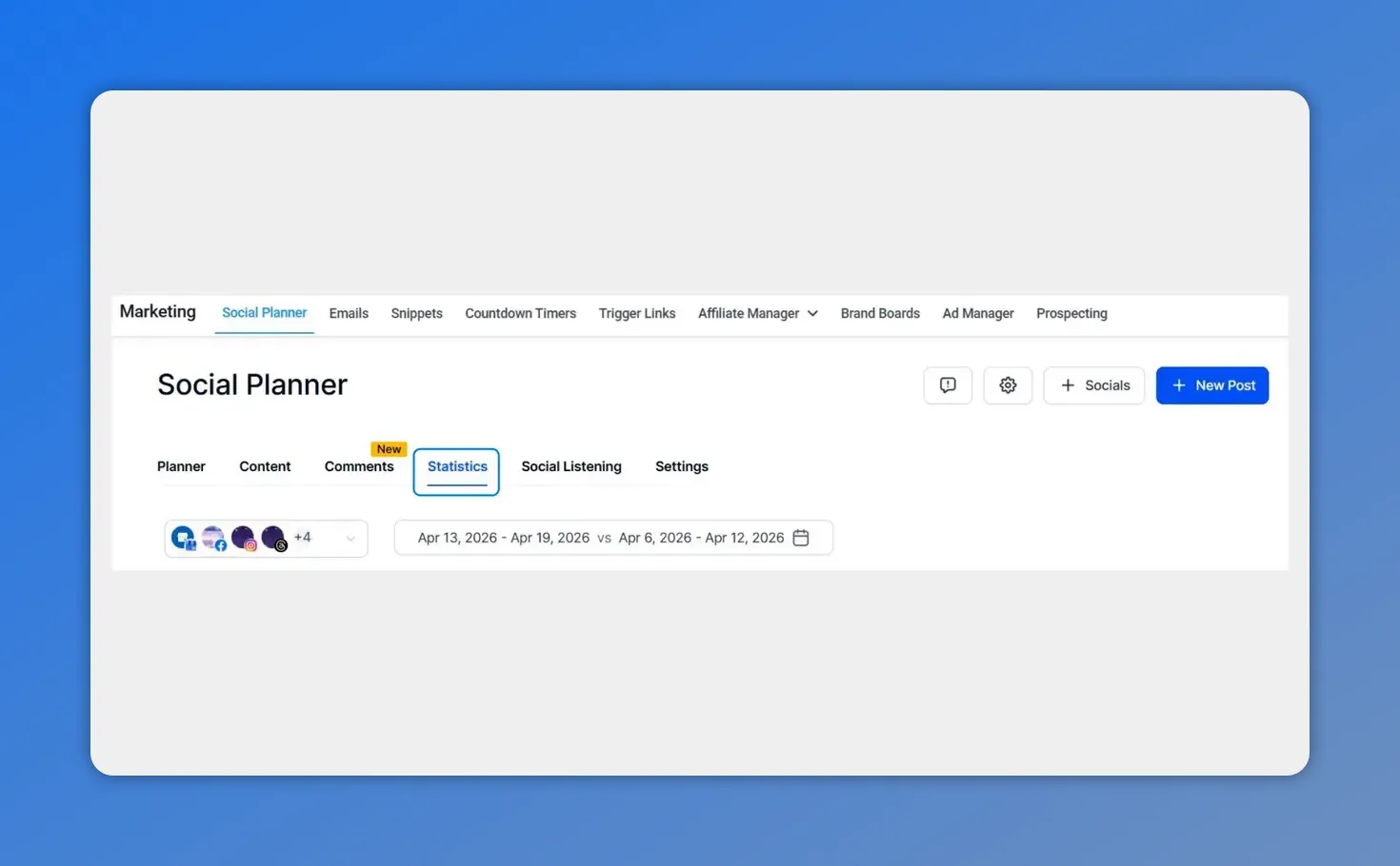
In Social Planner, click into the Statistics section—this is where the new date range selector lives.
2. Click the date selector
The date selector is where you control the reporting window. Instead of being limited to one fixed range, you can now define the period that matches your campaign or reporting needs.

The date range selector lets you choose your primary dates and set a comparison period—right inside Social Planner Statistics.
3. Set your desired date range
Choose the primary date range you want to analyze. This can be based on your specific campaign period, reporting window, or any other time frame relevant to your work.
This is especially useful when you want to review:
A product launch period
A promotional campaign
A monthly reporting window
A defined growth period

In the date range modal, you can see the primary From/To dates selected and the “Compare to” period set for benchmarking.
4. Select a comparison date range
After choosing your main date range, select the comparison window. This gives you a direct benchmark so you can measure changes in performance instead of looking at one period in isolation.
Comparison is what turns raw metrics into useful insight. It helps show whether results are improving, flat, or dropping.
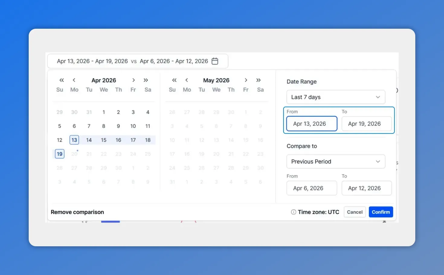
Here’s the comparison setup: choose your primary From/To dates, and Social Planner lets you define the “Compare to” period right alongside it.
5. Use a custom comparison range if needed
If the standard options do not match what you need, choose a custom comparison range and set those dates manually.
This gives you more control when comparing:
One campaign against another
One launch window against a previous launch
A current reporting period against a previous equivalent period
Any two timeframes that matter to your team

For a custom comparison, set your “From” and “To” dates in the date range calendar, then keep the selection ready for confirmation.
6. Click confirm
Once the date range and comparison period are set, click Confirm.
That refreshes the statistics view so you can immediately see updated KPIs, totals, and charts for the selected windows.
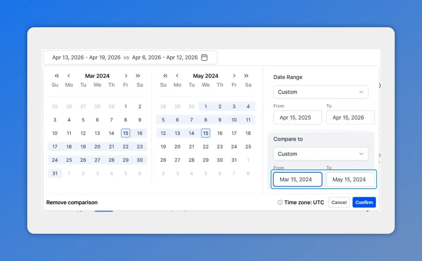
In the date range modal, your primary “From/To” dates and the comparison window are selected together—then you’ll confirm to apply them.
What happens after you confirm
Once your selection is applied, the statistics view updates right away. This immediate visualization is one of the biggest improvements in the workflow.
Instead of exporting data or building manual comparisons elsewhere, you can review the updated performance inside the platform. That makes it easier to spot changes quickly and keep analysis tied to the exact window you care about.
The refreshed view helps with:
KPI tracking for the date range you selected
Total performance review across the reporting window
Chart-based trend analysis with visual comparison
Faster reporting for clients, campaigns, or internal teams
Better analysis without external tools
One of the most practical benefits of this change is that it reduces the need to leave Social Planner just to answer simple reporting questions.
When the right date controls and comparison tools are built into the statistics view, it becomes much easier to:
Analyze exact campaign windows
Measure launch and promo periods accurately
Review trends over time
Build clearer reports based on real performance windows
That matters for agencies, social media managers, and in-house teams alike. Everyone benefits when the reporting workflow is faster and the analysis is based on the right dates.
How comparative views improve growth analysis
Comparative views are not just about seeing two sets of numbers side by side. They help explain performance.
When you compare one time period against another, you can better understand:
Whether growth is consistent or temporary
Which campaigns created stronger results
Where momentum is improving
Where adjustments are needed
This makes your analysis more useful and your reporting more persuasive. Instead of saying a campaign performed well or poorly, you can show how it performed relative to a meaningful benchmark.
And that leads to better decisions.
Use cases for custom ranges and comparison windows
The new selector is flexible enough to support many common reporting situations.
Campaign analysis
Set the date range to match the full campaign period, then compare it with a previous campaign or prior equivalent window.
Launch reporting
Review performance during a product or offer launch and compare it against a pre-launch or earlier launch period.
Promo reviews
Measure a short promotion using the exact dates it ran, rather than trying to fit it into a weekly default view.
Trend tracking
Compare one defined period against another to spot movement over time and identify real growth patterns.
Client-ready reporting
Build reports around the timeframes clients actually care about, with metrics and charts that line up with their campaign windows.
Why this creates stronger social reporting
Good social reporting is not just about collecting data. It is about communicating what is working, what needs improvement, and what action should come next.
That gets much easier when you can analyze the right period and compare it against the right benchmark.
This update helps teams communicate:
Strong points that deserve more attention or budget
Weak points that need adjustment
Performance changes across meaningful timeframes
Growth trends with clearer context
In short, the statistics view becomes more than a dashboard. It becomes a tool for better decision-making.
Quick recap of the workflow
Open Statistics inside Social Planner.
Click the date selector.
Choose your main date range.
Select a comparison date range.
If needed, set a custom comparison window.
Click Confirm to refresh KPIs, totals, and charts.
FAQ
What replaced the fixed 7-day view in Social Planner Statistics?
The fixed 7-day view was replaced with a custom date range selector and a comparative view selector. This allows more flexible analysis based on the exact time period you want to review.
How do we compare two time periods in Social Planner Statistics?
Open the Statistics view, click the date selector, choose your primary date range, then select a comparison date range. If needed, use a custom comparison option and click Confirm to update the charts and KPIs.
Can we use custom dates for campaign reporting?
Yes. The update is designed to support custom campaign windows, launch periods, promo dates, and reporting ranges so analysis matches the work being measured.
What updates after confirming the date range selection?
After you confirm, the statistics view refreshes immediately. KPIs, totals, and charts update to reflect the selected date range and comparison period.
Why is the comparative view useful for growth analysis?
It helps put results in context. By comparing one period against another, you can spot trends, measure changes, identify strengths, and see where improvement is needed.
Do we still need external tools for date-based reporting?
This update reduces that need by giving you built-in controls for custom analysis and comparisons directly inside Social Planner Statistics.
Open Social Planner Statistics, set the date range that matches your campaign, add a comparison window, and review the updated charts. It is a simpler way to get clearer insights and stronger reporting from the work you are already doing.
This article was created from the video How to Set and Compare Date Ranges in Social Planner Statistics