


Improve SMS Deliverability with the New Messaging Analytics
Messaging deliverability has a direct impact on customer engagement and revenue. If messages fail, opt-outs rise, or sending issues go unnoticed for too long, it becomes harder to keep reaching customers consistently.
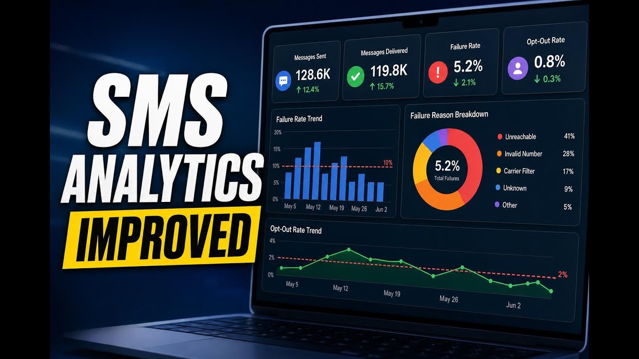
That is why we redesigned Messaging Analytics in Pinnacle to give teams deeper visibility into SMS performance. The updated experience includes interactive charts, a cleaner layout, richer data, and practical insights that help marketing and operations teams spot problems early and take action faster.
What changed in Messaging Analytics
The updated Messaging Analytics section is built to make trends easier to read and issues easier to diagnose. Instead of only showing top-line numbers, it now gives more context around how performance is changing over time and where specific problems are coming from.
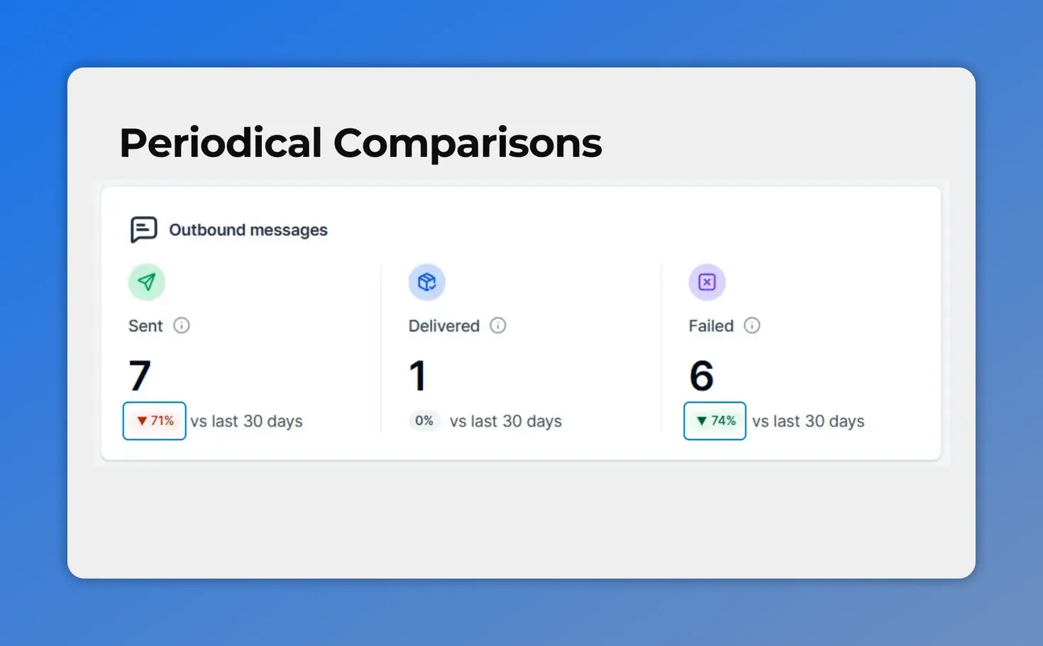
Period-over-period comparisons make it easy to see whether sent, delivered, and failed message metrics are improving or worsening.
The biggest improvements include:
Period-over-period comparisons on every key metric
A failure rate trend chart with a clear 10% threshold line
A failure reason breakdown that shows why messages are not being delivered
An opt-out rate trend chart with a 2% threshold marker
Flexible time ranges from 30 to 90 days
Clickable summary cards that open detailed message logs
Together, these changes make it much easier to monitor subscriber health, protect sender reputation, and reduce failed messages before they turn into bigger account-level issues.
See trend changes at a glance
Every metric in the new analytics view now shows how it changed compared to the previous period. Green and red indicators make it easier to spot movement right away.
This is a simple update, but it matters. Without comparison data, a number can look fine in isolation. Once you can see whether it is improving or getting worse, you have the context needed to respond quickly.
That means teams can identify whether failure rates are climbing, whether opt-outs are creeping up, or whether message performance is stabilizing after a change in strategy.
Track message failure rates before they become a bigger problem
One of the most useful additions is the new bar chart for message failure rate over time.
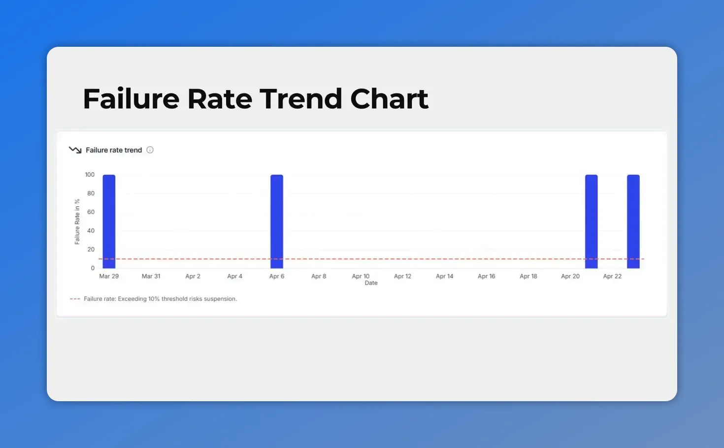
Failure rate trend chart includes a clear 10% threshold line, so you can spot when delivery risk is entering a more dangerous range.
This chart does more than show historical performance. It includes a visible 10% threshold line, which helps teams recognize when failure rates are moving into risky territory.
That threshold matters because delivery issues can escalate. If failure rates stay too high, it can lead to account restrictions and a damaged sender reputation. With this chart, teams can catch spikes earlier and investigate them before they affect the ability to contact customers.
Instead of reacting after delivery has already dropped off, teams can monitor trends as they develop and work from a clearer signal.
Understand exactly why messages failed
Knowing that messages are failing is only part of the picture. The next step is understanding why.
The new donut chart breaks down failure reasons so teams can take targeted action instead of guessing.
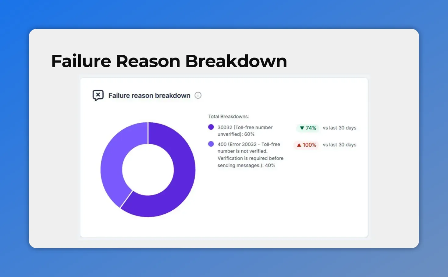
The failure reason breakdown shows which verification and error causes are driving message failures, making troubleshooting faster and more targeted.
This is a major improvement for troubleshooting. A high failure rate by itself can come from different causes, and those causes may require very different fixes. By showing the reason breakdown visually, Messaging Analytics helps narrow the problem faster.
That means less time spent hunting through logs without direction, and more time solving the actual issue.
Monitor opt-out rates to protect subscriber health
Deliverability is not only about failed messages. It is also about how contacts respond to what they receive.
The new line chart tracks opt-out rates over time and includes a 2% threshold marker. This gives teams a practical way to monitor subscriber health and adjust messaging strategy before opt-out levels become risky.
The new opt-out rate trend chart helps you spot when unsubscribe behavior starts trending upward. It also includes a practical 2% threshold reference so you know when the risk level increases.
If opt-outs begin trending upward, it can be a sign that message frequency, relevance, or timing needs attention. Seeing that movement over time helps teams make adjustments earlier instead of waiting for engagement to drop more sharply.
In short, the opt-out chart helps protect list quality while supporting a healthier long-term messaging program.
How to access Messaging Analytics in Pinnacle
Getting to the updated reporting is straightforward.
Open Account Settings
Go to the Phone System settings section
Select the Messaging tab
Switch to Messaging Analytics
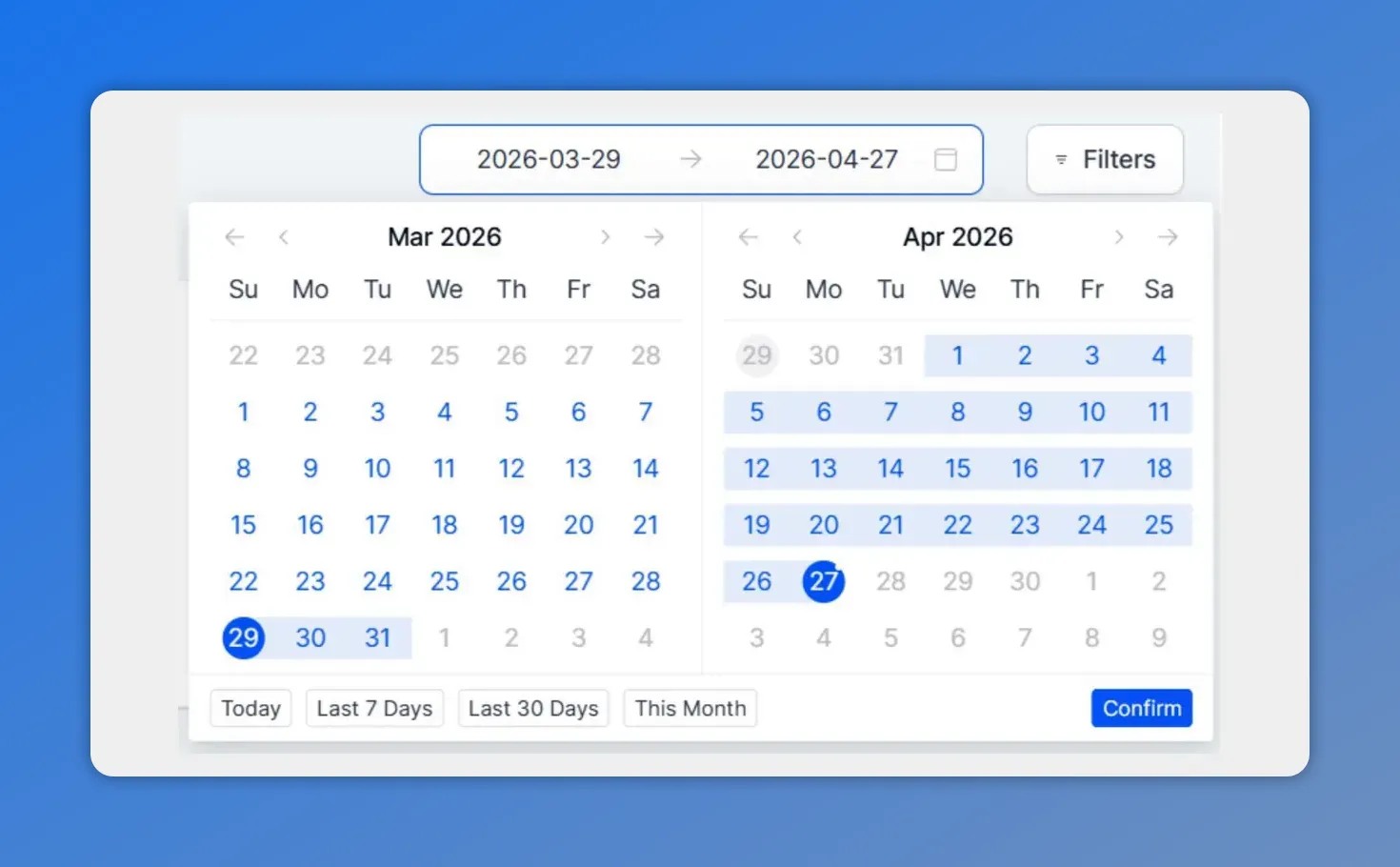
The date range picker lets you expand the default reporting window up to 90 days to better spot longer-term patterns.
The default view shows the last 30 days of data. If a broader trend is more useful, the date range can be expanded to include up to 90 days.
That flexibility helps with both short-term troubleshooting and longer-term performance analysis. A 30-day window can highlight recent changes, while a 90-day range makes it easier to spot patterns and recurring issues.
Drill into the details with clickable summary cards
High-level charts are useful, but sometimes teams need record-level detail to understand what is happening.
Every summary card in Messaging Analytics is clickable. Selecting a card opens a detailed logs modal with individual message records.
These logs include:
Contact name
Phone number
Message status
Date
Error codes
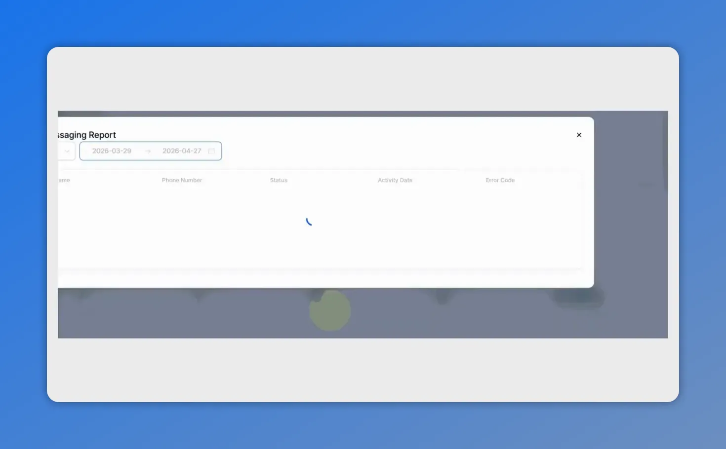
Clicking into Messaging Analytics opens a details view for individual message records, including phone number, delivery status, date, and error code.
This detail is especially useful for precise troubleshooting. Teams can move from a broad trend on a chart to the exact message records behind it, which helps connect performance changes to real delivery outcomes.
That combination of summary-level visibility and drill-down detail makes the analytics section much more actionable.
Why these updates matter
Messaging performance is not just a reporting concern. It affects whether businesses can reliably contact customers, maintain engagement, and keep revenue-driving communication channels healthy.
The new Messaging Analytics experience in Pinnacle is designed to support that work in a more practical way. Teams can now:
Spot performance changes faster
Catch failure rate spikes before they lead to bigger delivery issues
Identify the root causes behind failed messages
Monitor opt-out trends and adjust strategy earlier
Protect sender reputation with better visibility
Investigate individual message records when deeper troubleshooting is needed
And that is the real value of the redesign. It helps teams move from reacting to messaging problems after the fact to managing deliverability more proactively.
FAQ
Where can we find Messaging Analytics in Pinnacle?
Open Account Settings, go to the Phone System settings section, select the Messaging tab, and switch to Messaging Analytics.
What time range does Messaging Analytics show?
The default view shows the last 30 days. Teams can expand that range to view up to 90 days of messaging data.
What is the purpose of the failure rate chart?
The failure rate bar chart shows how message failures change over time and includes a 10% threshold line. This helps teams identify delivery issues early and reduce the risk of account restrictions.
What does the failure reason donut chart show?
It breaks down the reasons messages failed, so teams can take targeted action instead of guessing at the cause.
Why is the opt-out rate chart important?
The opt-out trend chart helps teams monitor subscriber health over time. It includes a 2% threshold marker so messaging strategy can be adjusted before opt-out levels become risky.
Can we inspect individual message records?
Yes. Every summary card is clickable and opens a detailed logs modal with contact name, phone number, status, date, and error codes.
If your team relies on SMS to reach customers, the updated Messaging Analytics section is worth using regularly. It gives a clearer picture of what is working, what is slipping, and where action is needed to keep deliverability strong.
This article was created from the video Improve SMS Deliverability with the New Messaging Analytics