


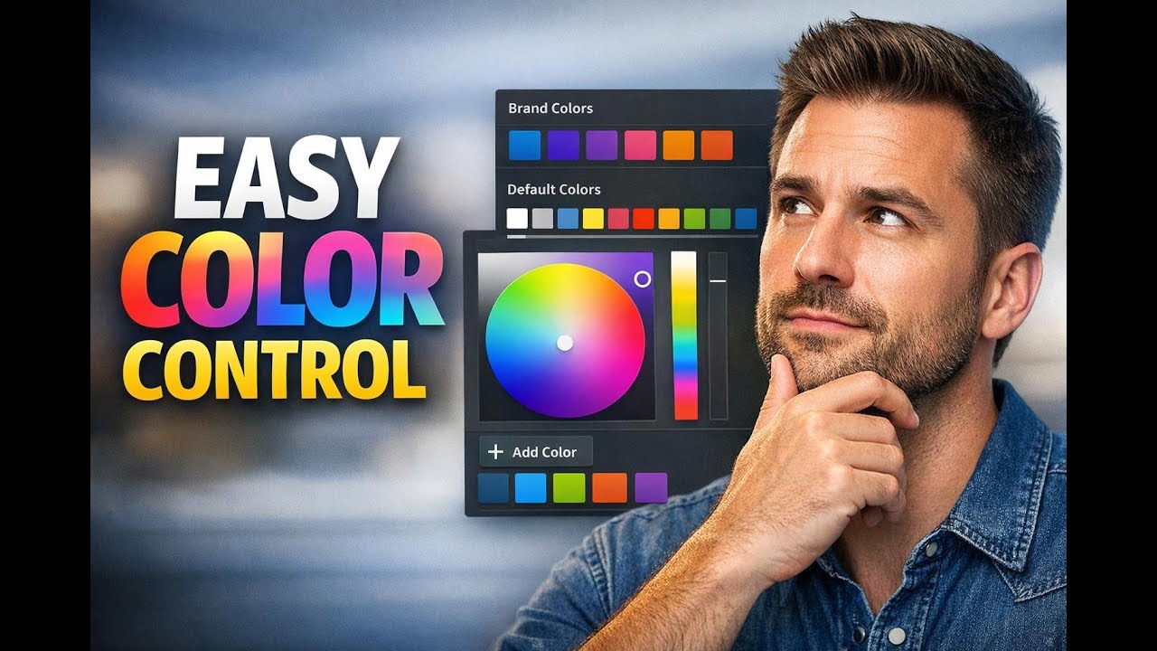
Brand Colors in Color Picker: Save Once, Apply Across Projects
Manually copying and pasting hex codes is one of those small tasks that slows everything down. It also makes it harder to keep forms, surveys, and other assets consistent across a team.
That is why the updated Pinnacle builder color picker matters. It gives us direct access to brandboard colors inside the builder, along with a better way to save and reuse global custom colors across projects.
Instead of hunting for color values in another tab, we can now pick saved colors where we are already working, apply them faster, and keep styling more consistent.
What changed in the builder color picker
The color picker now has clearer organization. Colors are separated into distinct sections, which makes it easier to find the right option without guessing.
- Brand Colors for saved colors from the brandboard
- Default Colors for standard built-in options
- Global Custom Colors for saved colors that can be reused across projects
This matters because color choices are no longer buried in a single list. We can quickly tell whether we are using an official brand color, a default option, or a custom color our team has saved for repeated use.
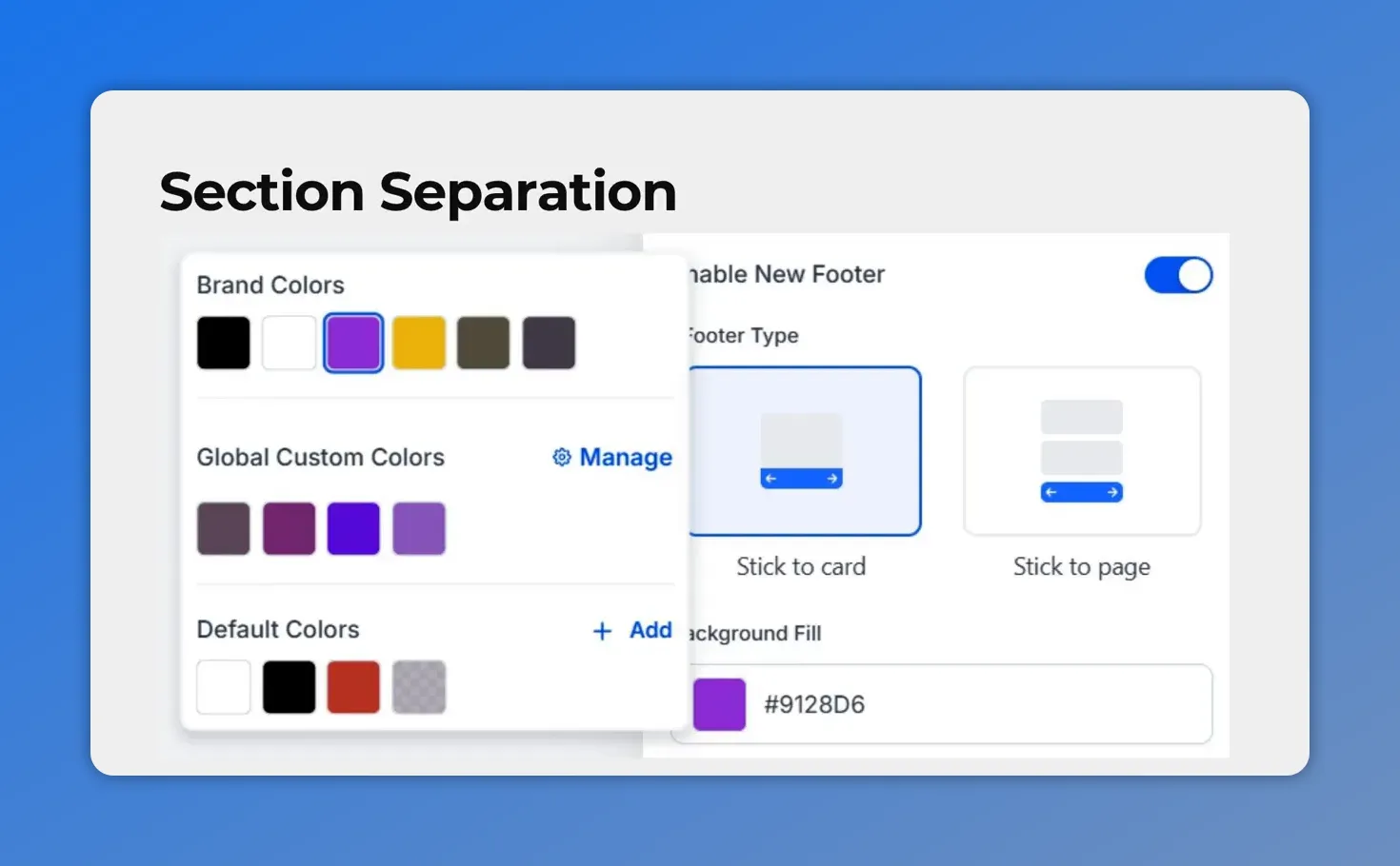
The updated builder color picker clearly separates Brand Colors, Global Custom Colors (with Manage), and Default Colors—so you can tell what you’re selecting at a glance.
Why this update is useful
The biggest benefit is consistency. When colors are saved and easy to access, it becomes much easier to keep buttons, forms, and survey elements aligned with brand standards.
It also reduces common workflow problems, such as:
- Copying the wrong hex code
- Re-entering the same color over and over
- Switching between tabs to find saved brand values
- Using slightly different shades by mistake
And because saved colors are available directly in the builder, updates are simpler too. Teams can create and apply custom colors without relying on manual notes or separate reference docs.
Using saved brand colors while styling elements
One practical example is button styling. When we open the color picker for a button or another design element, we can now choose from saved brand colors directly.
Once a saved color is selected, the builder automatically shows the preview. That gives immediate feedback and makes it easier to style with confidence.
This is a small improvement, but it removes friction. We spend less time checking whether a color is correct and more time building.

The color picker is organized into clear sections—Brand Colors, Global Custom Colors, and Default Colors—so you can choose the right saved option without guessing.
How global custom colors work
Global custom colors are for colors we want available beyond a single build. If there is a custom shade we use often, we can save it once and access it across projects.
That is especially helpful when a team uses a few recurring colors that may not already be part of the brandboard, but still need to stay consistent in forms and surveys.
The builder includes a Manage option for this. From there, we can add a new global custom color and make it available for future work.
How to add a new global custom color in the builder
Here’s how the process works inside the form or survey builder.
- Open the form or survey builder.
- Go to the color settings.
- Click Manage to open Global Custom Colors.
- Click Add New.
- Pick your color and save it.
- Close the pop-up window.
- Apply the newly saved color to your build.
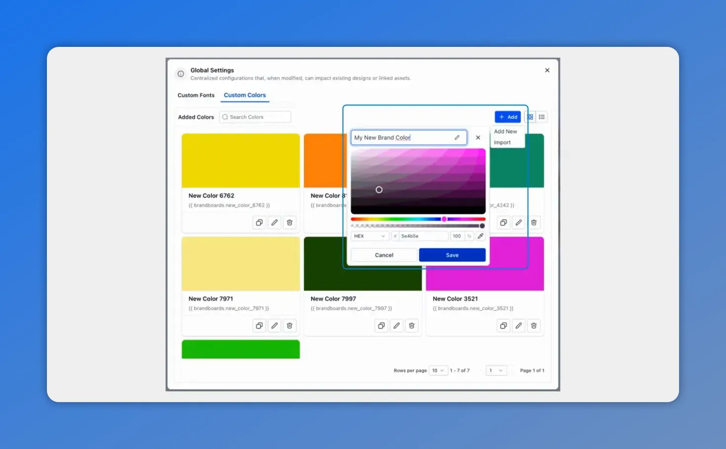
In Global Settings, you can add and save a new color once—this is the step that the workflow section is leading into.
This workflow keeps everything in one place. We do not need to leave the builder, look up a color elsewhere, then return and paste the value manually.
A better workflow for forms and surveys
For teams building forms and surveys regularly, these updates can make daily work smoother.
With direct access to brand colors and reusable global custom colors, we can:
- Style assets faster
- Keep branding more consistent
- Cut down on manual errors
- Reduce unnecessary tab switching
- Make color updates easier for the whole team
And because the builder shows a preview when a saved color is selected, it is easier to confirm choices as we work.
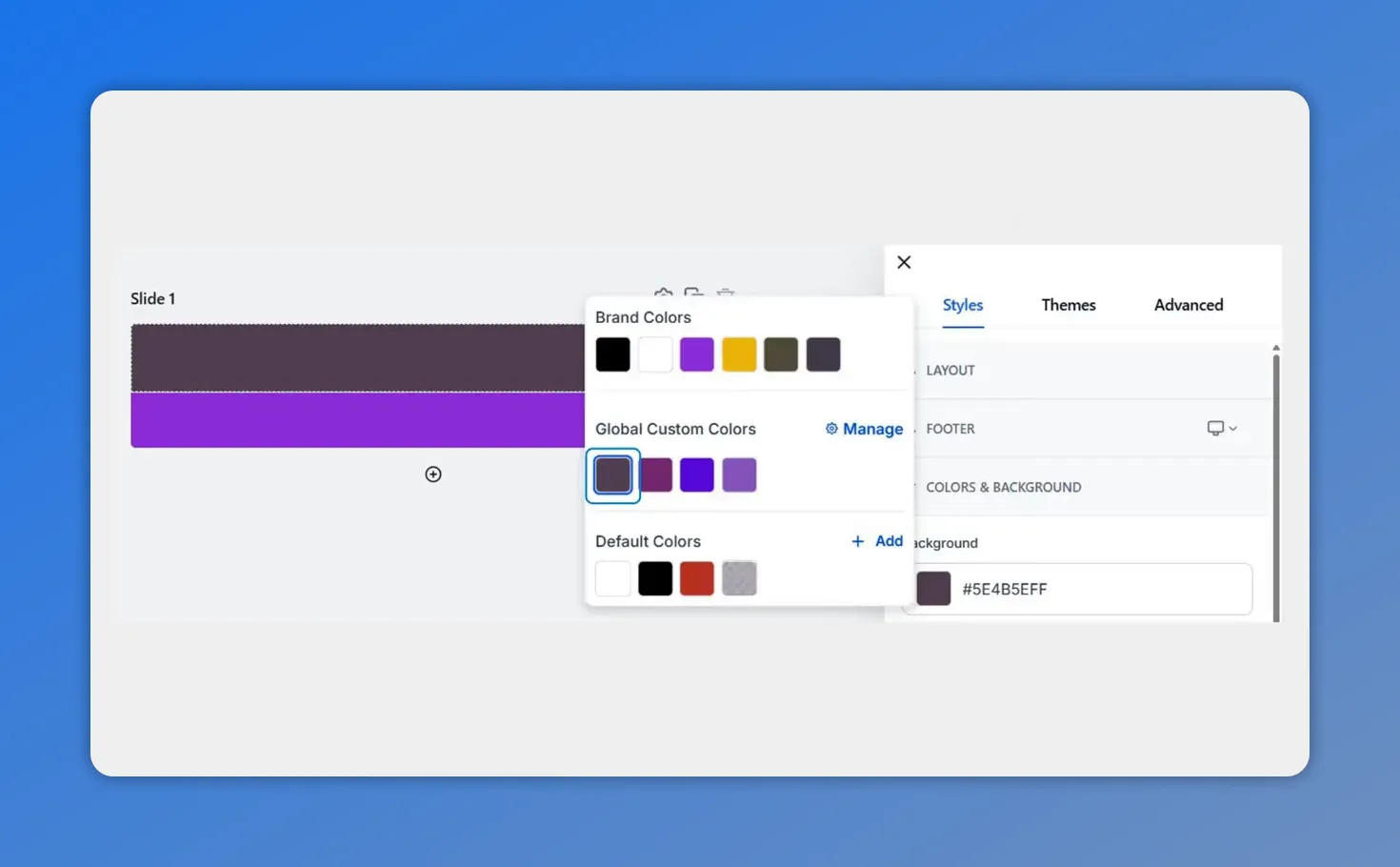
Global Custom Colors are highlighted in the updated color picker, showing where saved reusable shades live next to Brand Colors and Default Colors.
Best times to use brand colors vs. global custom colors
Use brand colors when
- The color is already part of your official brandboard
- You want to apply approved branding across assets
- You need fast access to standard brand styling
Use global custom colors when
- You have a recurring color that is not already saved in the brandboard
- Your team needs a reusable custom shade across multiple projects
- You want to avoid re-entering the same custom value every time
Both options support consistency. The main difference is whether the color comes from your saved brand palette or a reusable custom setup created in the builder.
Why this improves team collaboration
Color consistency is not just a design issue. It affects how smoothly teams work together.
When everyone has access to the same saved colors inside the builder, there is less room for mismatched styling and less back-and-forth about which code to use. A shared, reusable color system helps keep output aligned, even when multiple people are building across different projects.
That means fewer corrections, fewer small errors, and a cleaner process overall.
FAQ
What sections are included in the updated color picker?
The updated color picker includes separate sections for Brand Colors, Default Colors, and Global Custom Colors.
Can we use saved brandboard colors directly in the builder?
Yes. Saved brandboard colors can be selected directly while styling elements such as buttons in the builder.
What happens when we select a saved color?
The builder automatically shows a preview of the selected saved color, which helps confirm the choice right away.
How do we add a global custom color?
Open the form or survey builder, go to Color settings, click Manage, choose Add New, pick your color, save it, then close the window and apply the saved color to your build.
Are global custom colors available across projects?
Yes. Global custom colors are designed to be accessed across projects, which makes them useful for repeated styling needs.
Why is this better than copying hex codes manually?
It saves time, reduces errors, avoids tab switching, and helps keep branding consistent across forms, surveys, and other assets.
Try it in your builder
If your team builds forms or surveys often, this update is worth using right away. Open the builder, go to the color settings, and add a global custom color. Once it is saved, it becomes much easier to keep your work consistent without relying on copied hex codes.
Simple changes like this can make the building process cleaner, faster, and more reliable across every project.
This article was created from the video Brand Colors in Color Picker: Save Once, Apply Across Projects


