Courses Dashboard Update: Faster Insights and Key Metrics

Courses help you educate customers and deliver value.
At Pinnacle, we redesigned the Courses dashboard to combine cleaner design with faster performance. The goal is simple: give teams quick, actionable insights so they can improve course outcomes without wasting time or resources.
What the dashboard shows at a glance
The new dashboard highlights the metrics that matter most for course performance and revenue. Each visual is built to answer a specific question quickly so we can decide which courses to update, improve, or retire.
Top and least performing courses
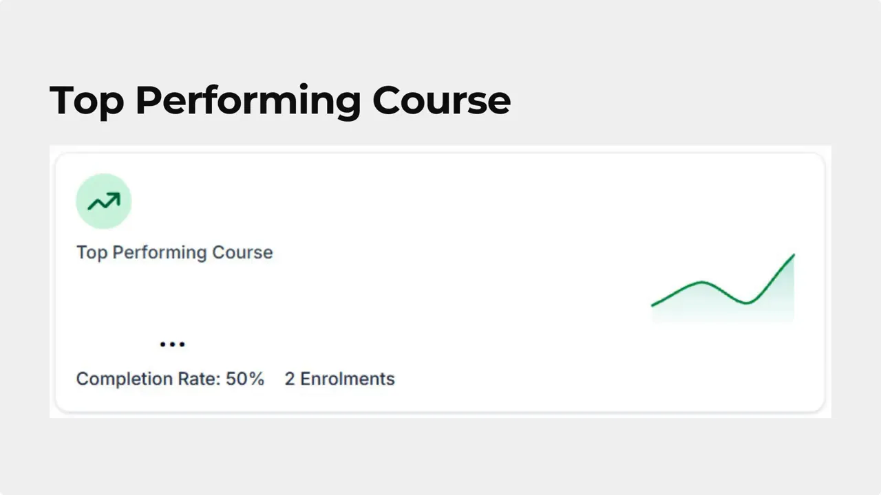
Top Performing Course shows the course with the highest engagement over the last 30 days. That helps us recognize what is working and replicate success across other content.
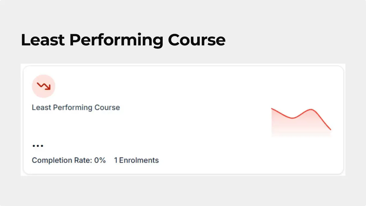
Least Performing Course shows the course with the lowest engagement or completion rate. This flag helps us prioritize updates or consider retiring low-value content.
Revenue snapshot and deep analytics
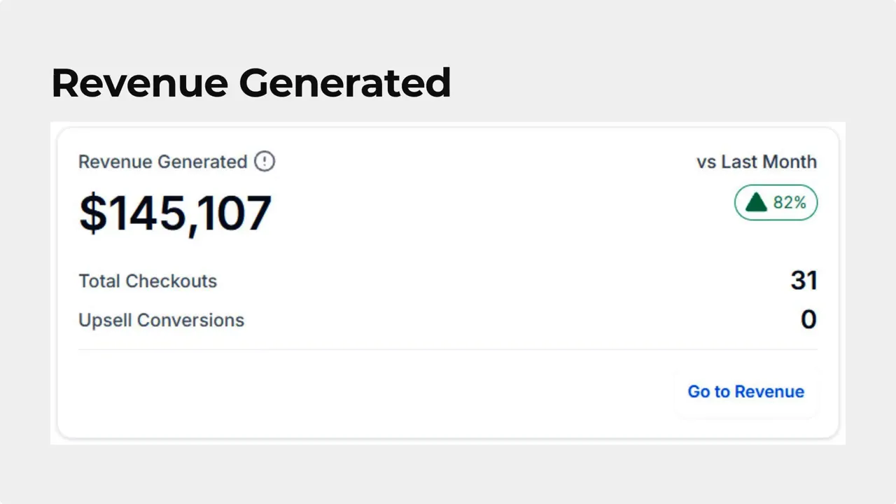
Revenue Generated gives a quick snapshot of total earnings from courses. If we need more detail, the Go-To Revenue option opens the full revenue analytics view for deeper exploration.
Average Order Value shows the average revenue per learner. This metric helps us understand how course pricing and packaging affect overall revenue.

Course Progress Funnel
The funnel visualization tracks how learners move through the course journey. Hovering over the funnel reveals a user breakdown of signed up, started, and completed percentages. That immediate view helps pinpoint where learners drop off.
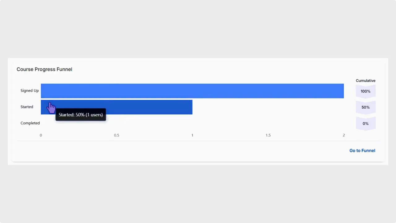
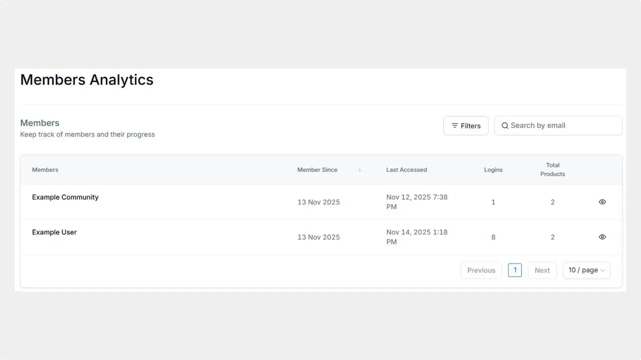
Clicking Go to Funnel redirects to Members Analytics for detailed course progress, learner-level data, and exportable reports. Exporting lets us run further analysis or share results with stakeholders.
How to use the dashboard effectively
Start with the Top and Least Performing cards to prioritize attention.
Check Revenue Generated and Average Order Value to connect engagement with income.
Use the funnel breakdown to identify drop-off points and design targeted fixes.
Click through to Members Analytics for learner-level data and to export reports for deeper analysis.
Quick checklist
Identify top and low performers in the last 30 days.
Compare revenue and average order value across courses.
Inspect the funnel to find where learners stop progressing.
Export learner-level reports to plan course updates or retirements.
FAQ
What does Top Performing Course show?
The Top Performing Course card displays the course with the highest engagement in the past 30 days so we can quickly see what is resonating with learners.
How is Least Performing Course determined?
Least Performing Course shows the course with the lowest engagement or completion rate, helping us spot content that needs improvement or removal.
What is included in Revenue Generated?
Revenue Generated provides a snapshot of total course earnings. Use the Go-To Revenue option to access detailed revenue analytics for transaction-level breakdowns.
How does the Course Progress Funnel work?
Hover over the funnel to view percentages of signed up, started, and completed learners. Click Go to Funnel for detailed progress analytics, learner-level data, and exportable reports. That click redirects to Members Analytics for deeper analysis.
Can we export learner data for further analysis?
Yes. The funnel view includes options to export learner-level reports so we can run custom analyses or share findings with the team.
Closing notes
The dashboard focuses on speed and clarity so we can make better decisions, faster. By combining top-level metrics with quick paths to detailed analytics, we reduce the effort needed to keep courses effective and aligned with customer needs.
We hope this update helps streamline how we manage and improve course content.
This article was created from the video Courses Dashboard Update: Faster Insights and Key Metrics


